Film and creative
The Blue Horizon
Brand identity, guidelines and website for an AI film studio.
Context
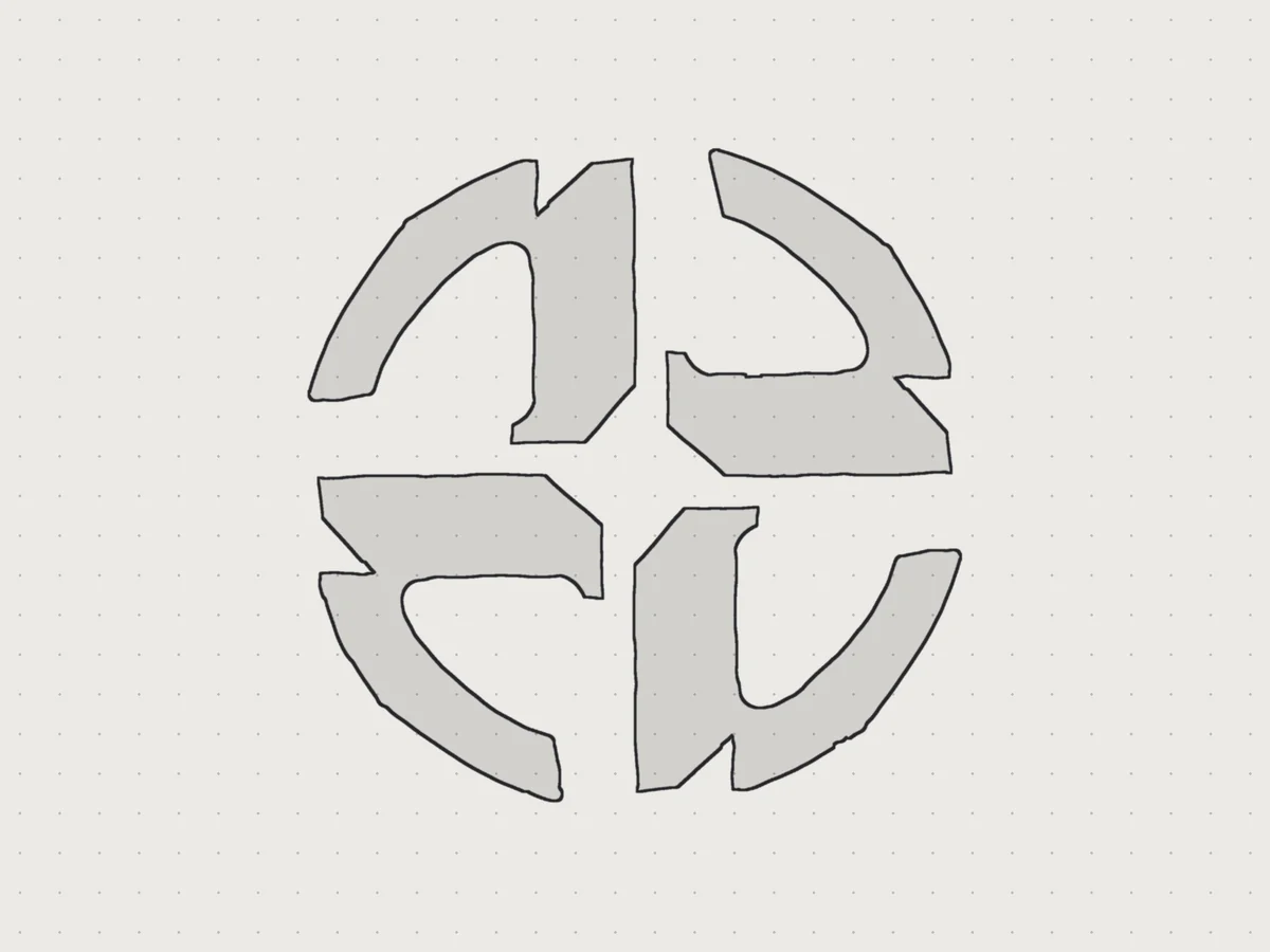
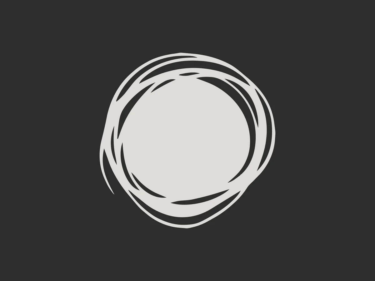
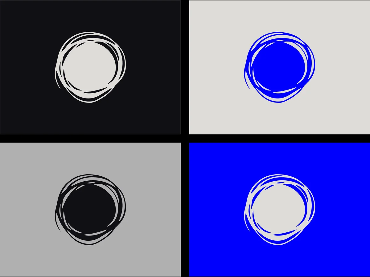
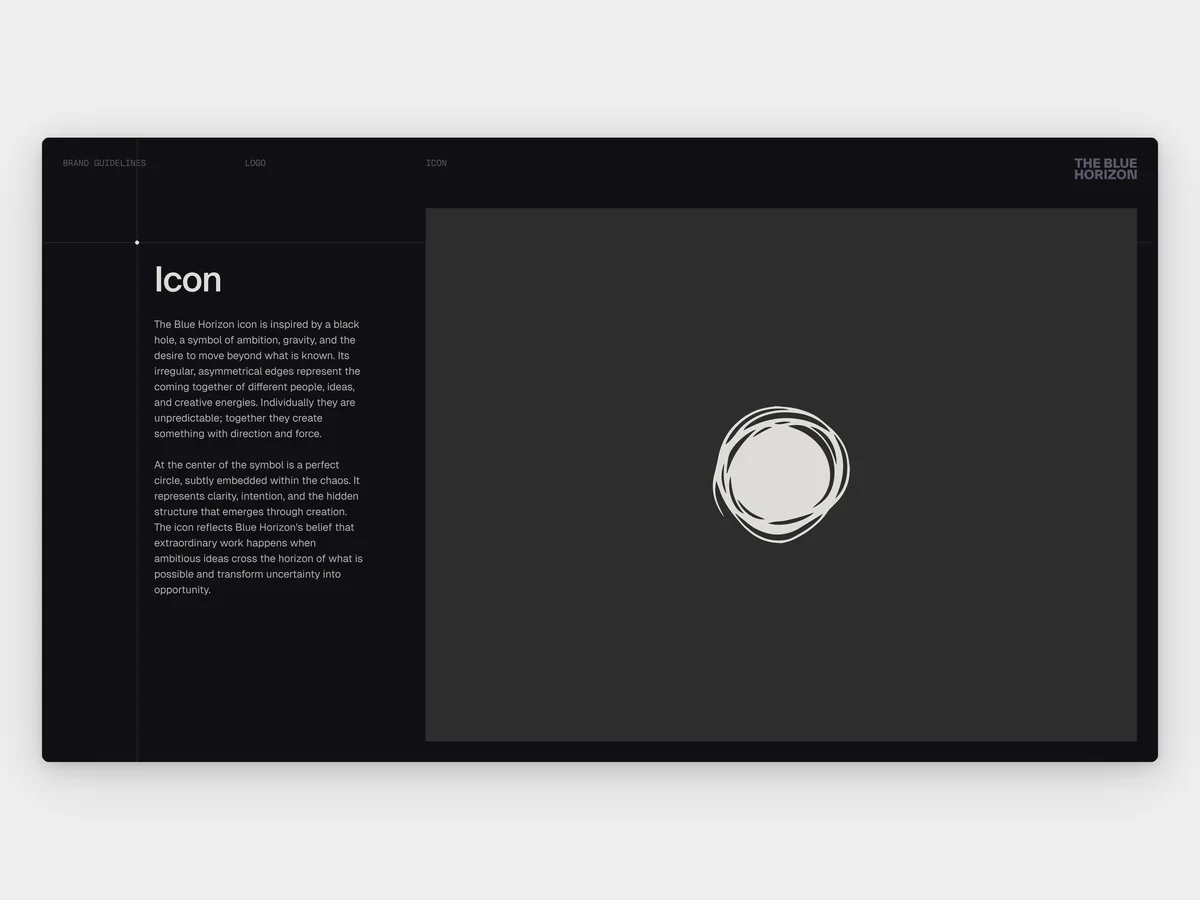
The Blue Horizon is an AI film studio run by four cofounders, making original series and films, commercials and viral work. The founders said their old site was costing them deals. In May 2026 they brought LayerTwo in for an identity, brand guidelines and a website, and asked that the brand stay minimal and let the films speak. They already had a logo, a black hole drawn with rough, uneven edges around a hidden perfect circle. A careers site joined the scope in June, and the main site launched in July 2026.
Strategy
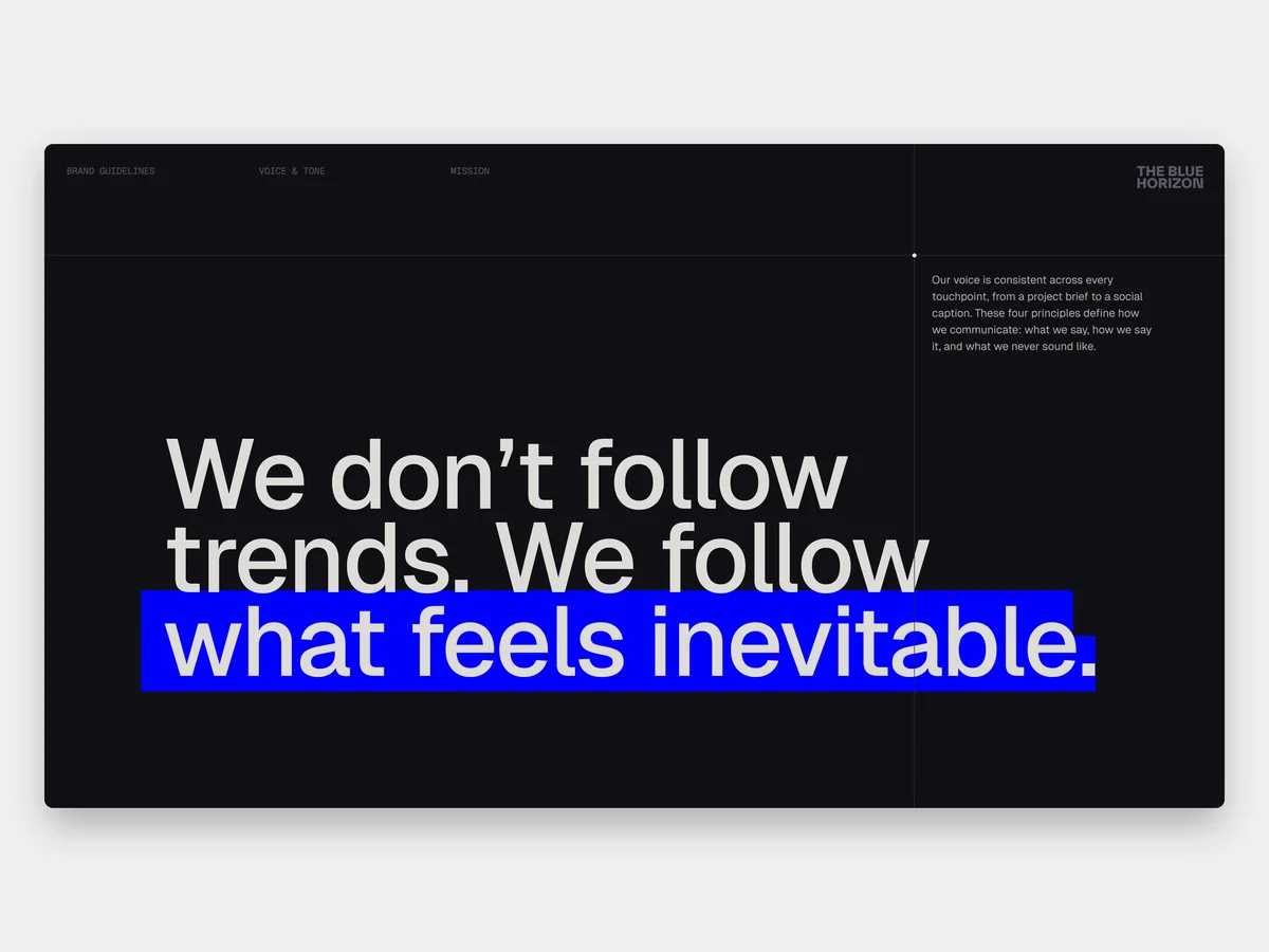
The founders’ logo held the idea. The edge of a black hole is its event horizon, the line past which nothing comes back the same, so we made that line the rule of the brand. Every project has a threshold, and the studio’s job is to cross it and bring back a world. Everything on the near side is monochrome, ordered and quiet, built on a grid you can see. Electric blue only appears at the crossing. In May we showed the founders three routes into the brand. One started from the spark that begins a film, one from the pull of a single blue, and one from the threshold. On June 1 they chose the threshold. They liked that it said a lot without trying too hard, and they asked us to pull back on the space imagery, because the studio sits closer to pop culture and sport than to science fiction.
Exploration
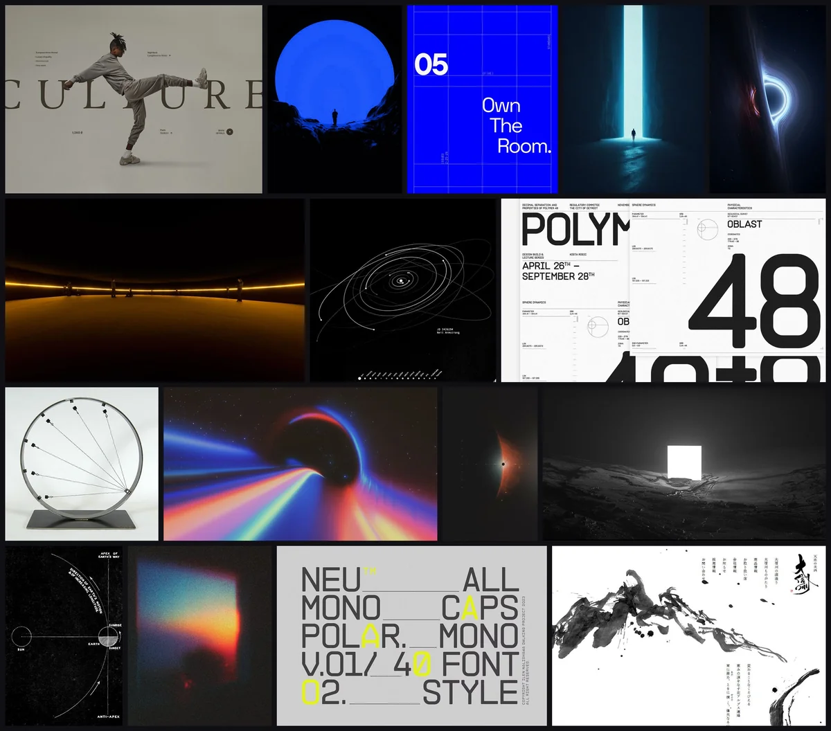
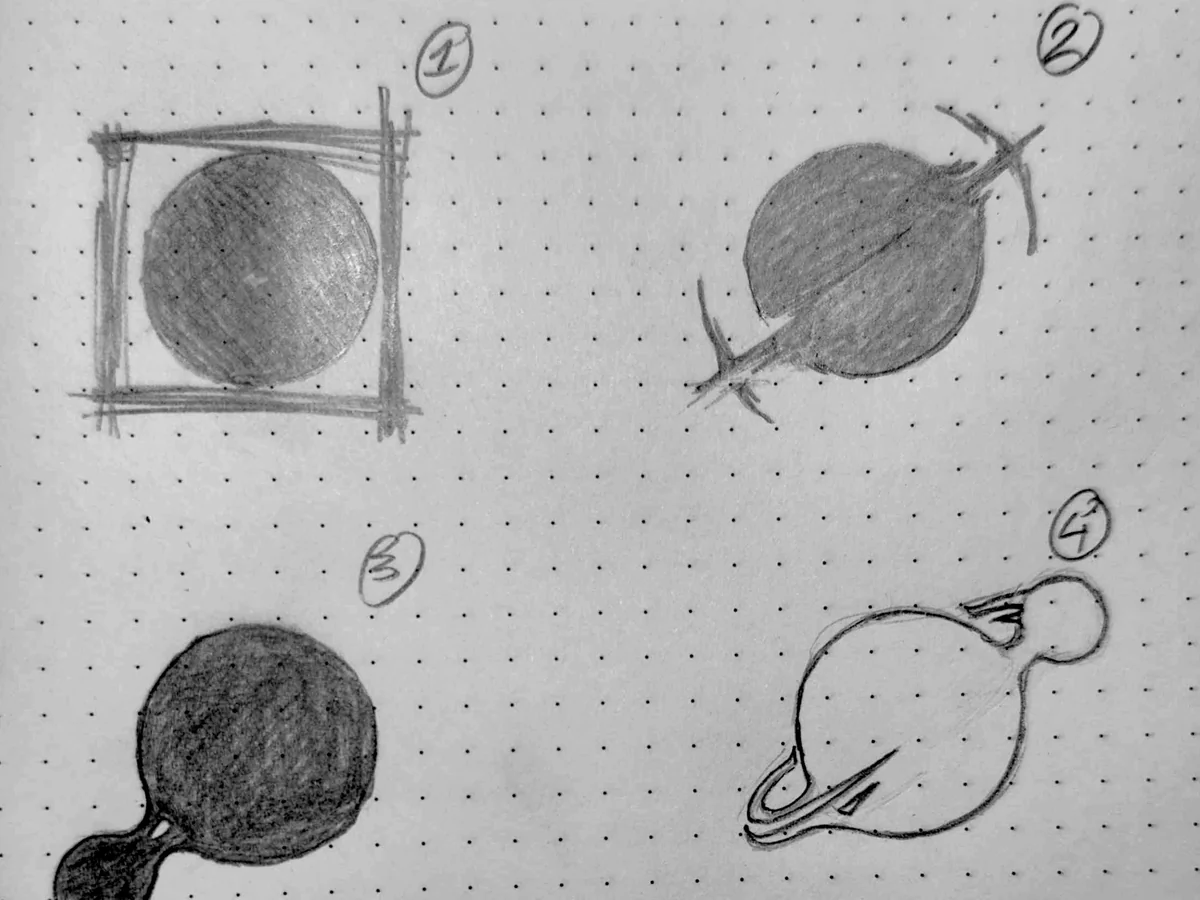
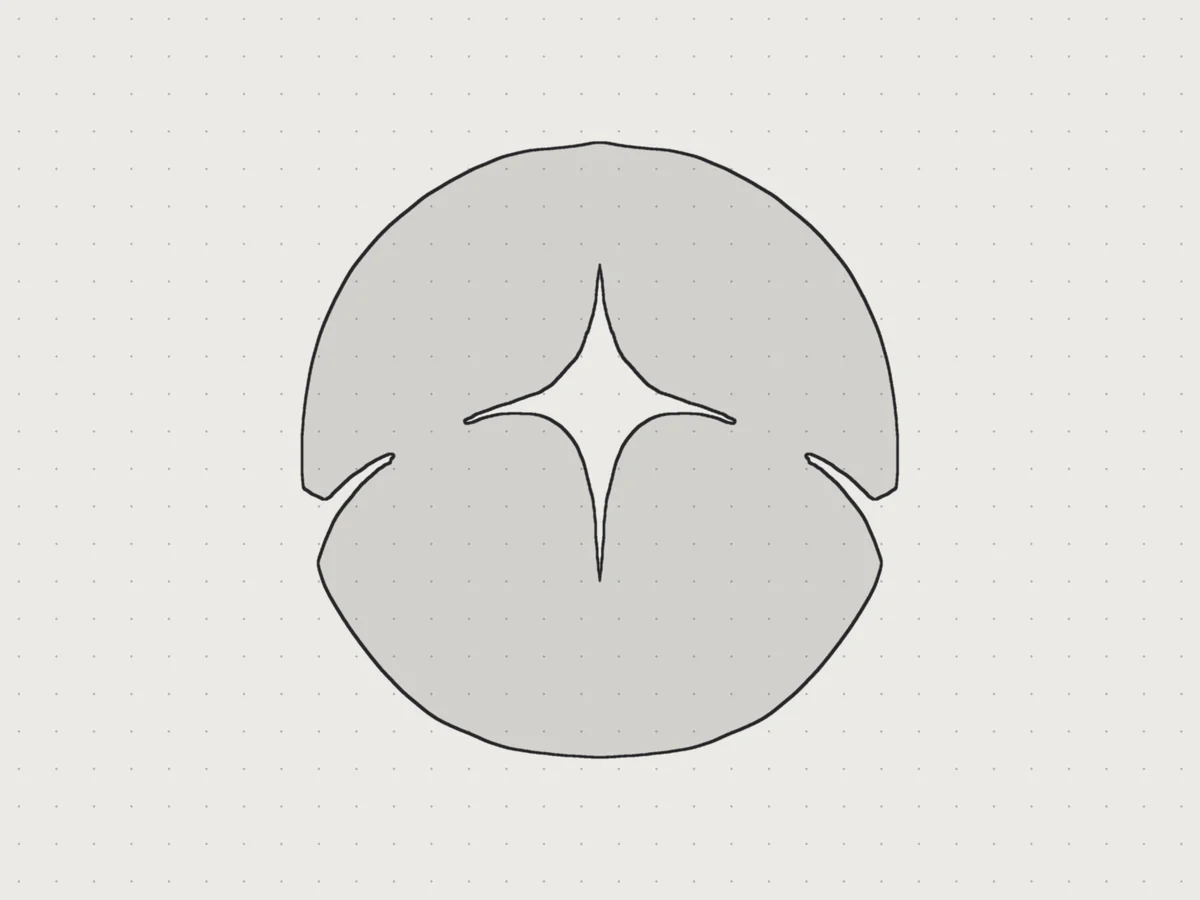
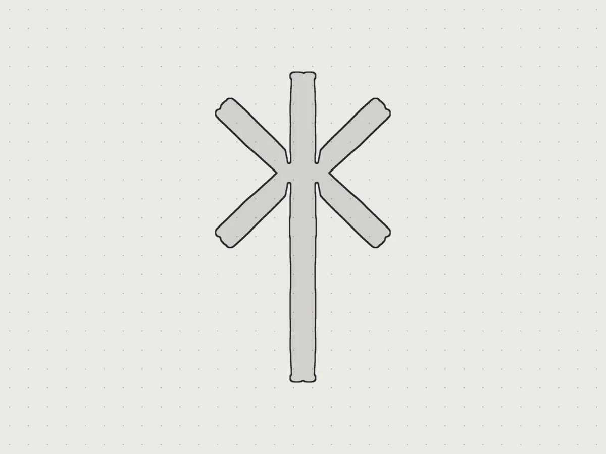
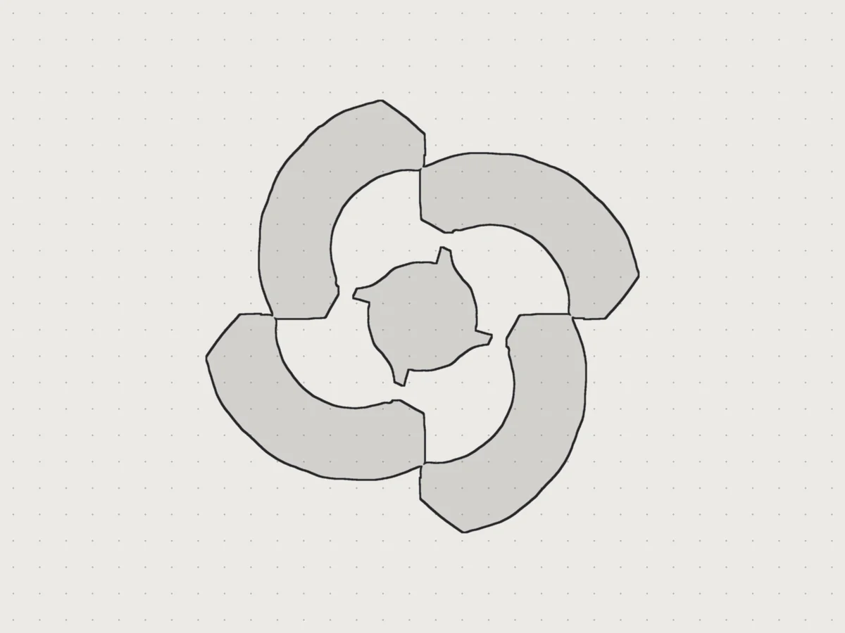
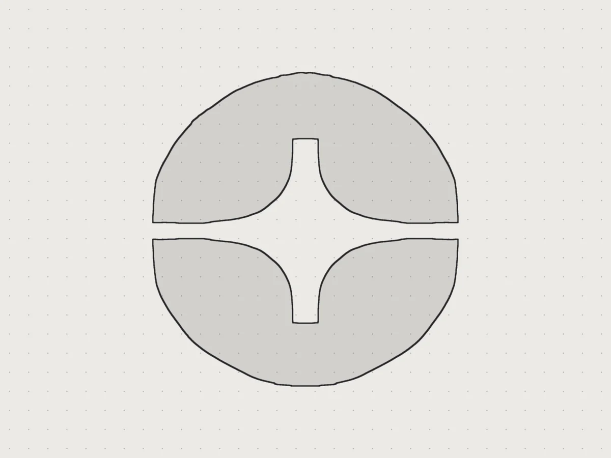
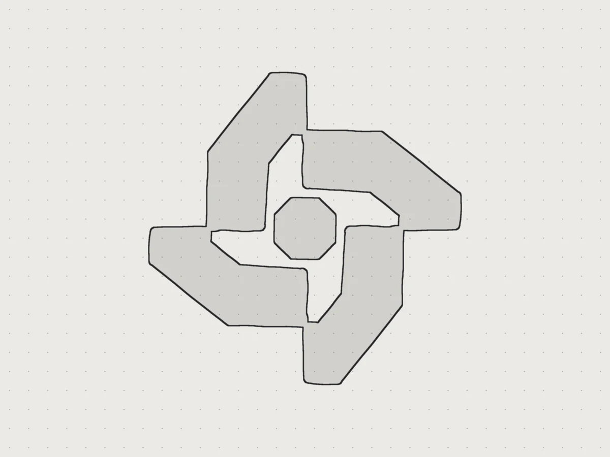
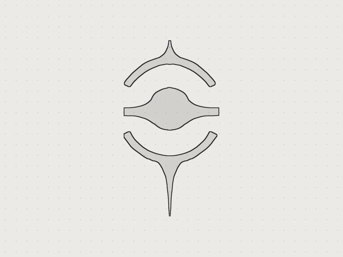
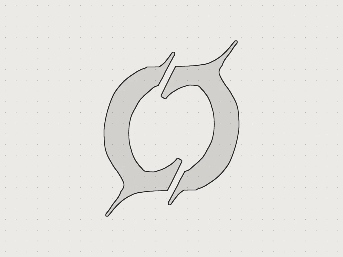
Each route had its own moodboard. We collected light breaking into dark rooms, lone figures at the edge of something huge, orbit diagrams and mono type set on a strict grid. We sketched marks in pencil too, and in June we drew eight new icons, from a star cut out of a circle to a split ring. We showed them to the founders on June 23. They loved the black hole they already had and chose to keep it, so we built the brand around their mark.
Design Direction
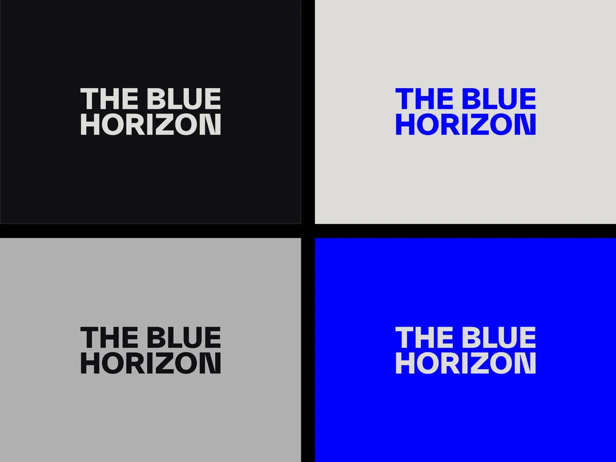
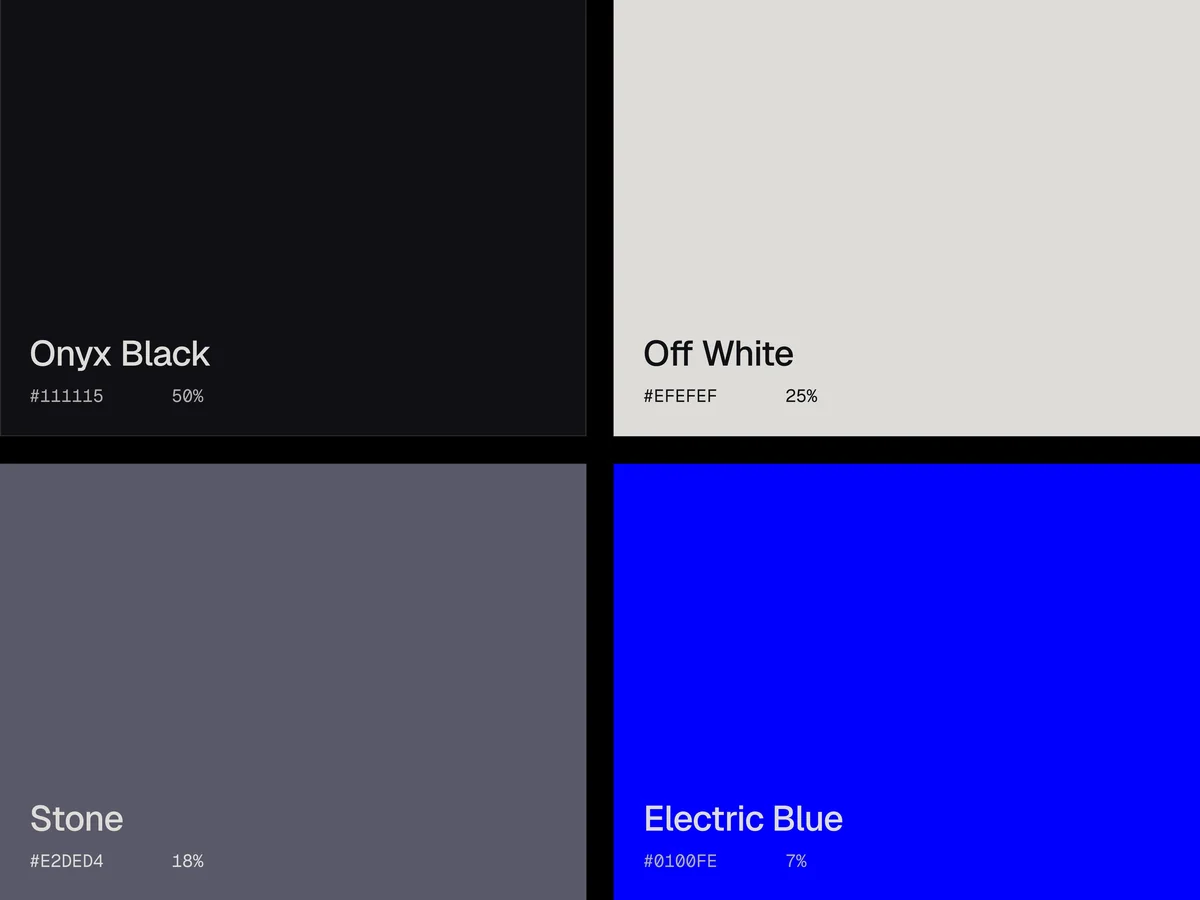
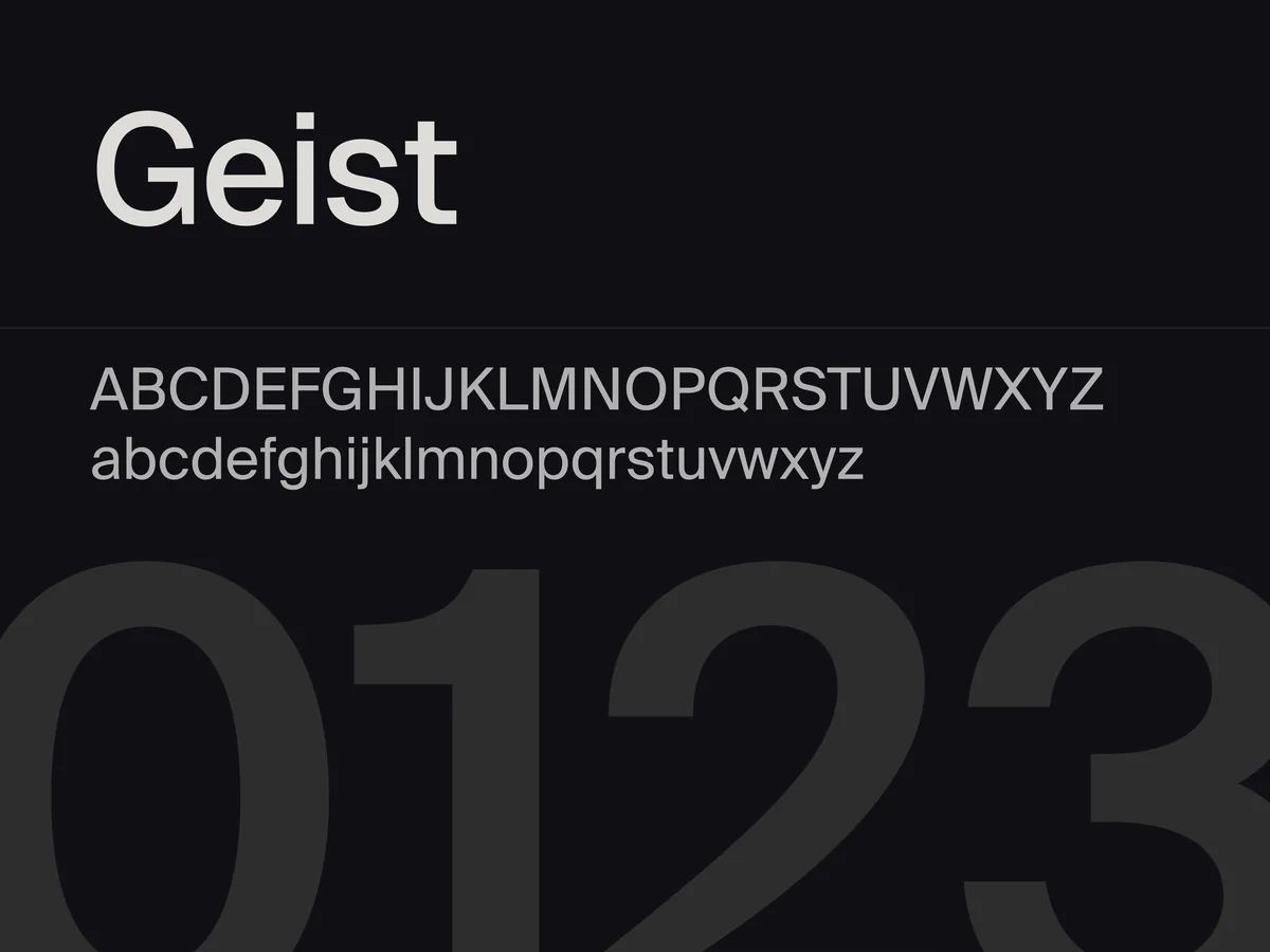
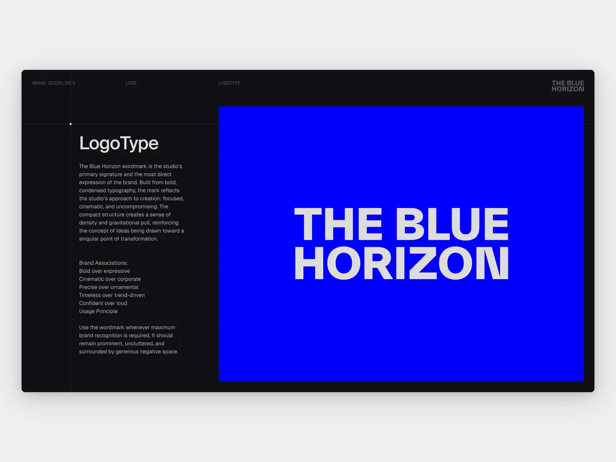
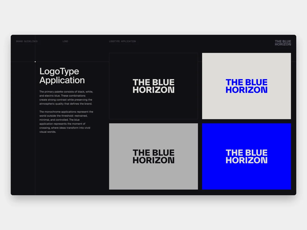
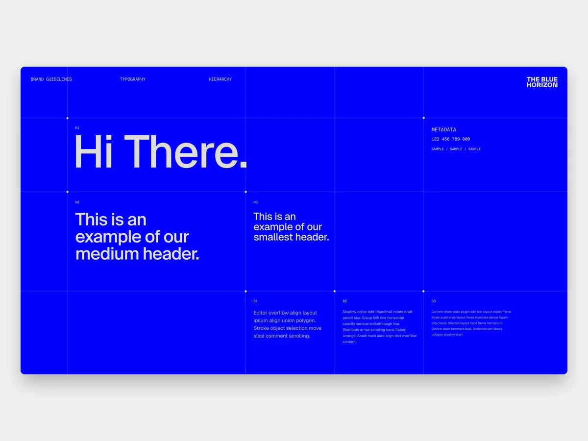
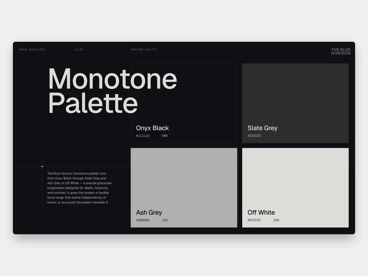
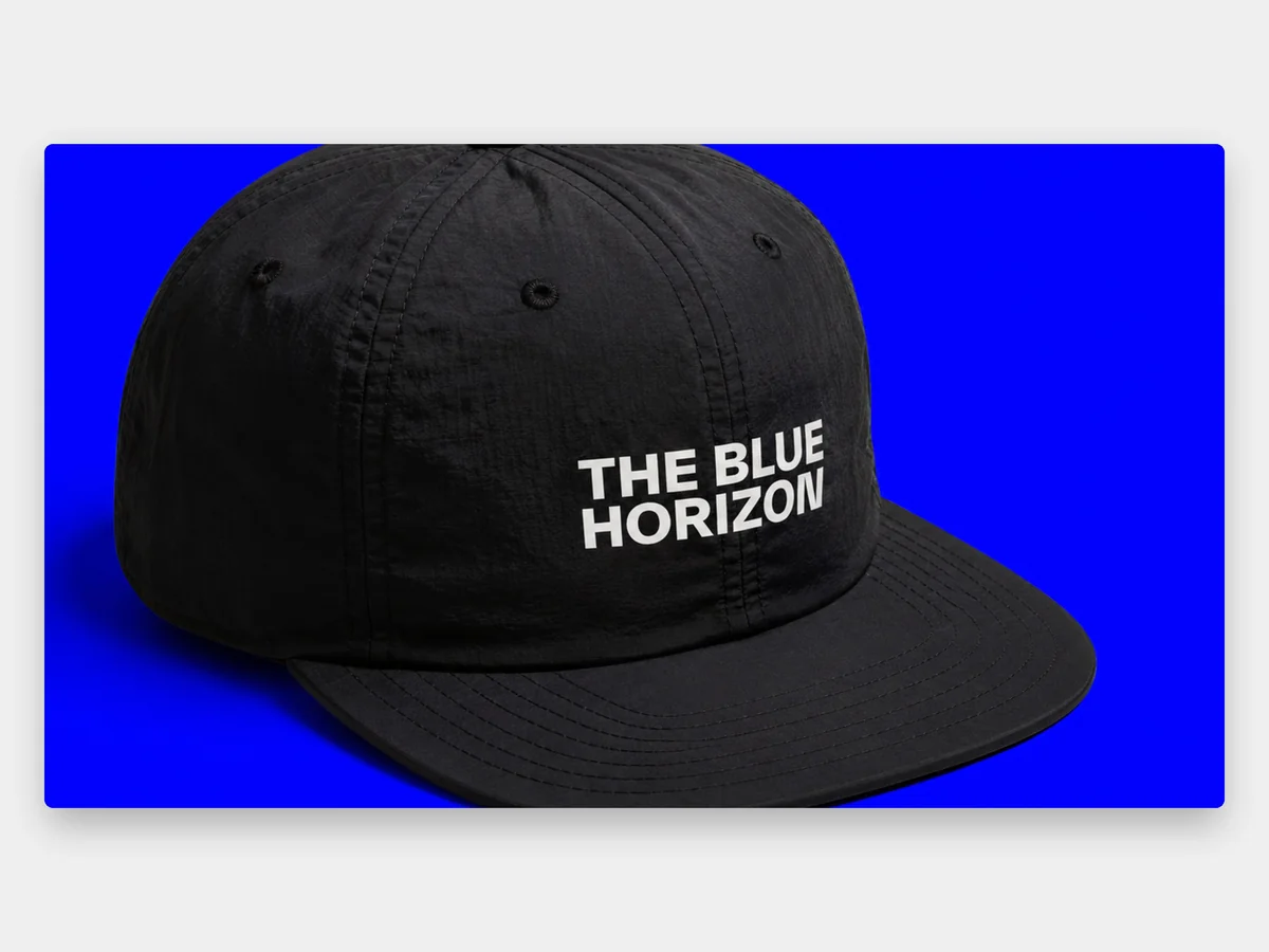
The icon is the founders’ own black hole. The wordmark is set bold and condensed so it holds at small sizes, down to the foot of a slide, and both work in black, off-white, grey and electric blue. The palette is weighted: onyx black for half of it, off-white and stone for type and surfaces, and electric blue for seven percent. The grid is part of the look. A small point sits at the corner of each block of content, hairlines run from it across the page, and points appear only where there is something to anchor. Geist sets the type, and Geist Mono carries every label, date and credit.
Guidelines
The brand book went to the founders on June 9 and carries the threshold into every application: monochrome for the world outside it, electric blue for the moment of crossing. It sets how the mark sits, how the palette is weighted, where the grid shows and how the type steps down from the wordmark to the labels. The founders wanted it to define how every material gets made, from the site to the decks they pitch with.
Website
The website puts the films on the far side of the threshold. The home page is a field of films that loops in every direction, and when you stop, the nearest one snaps to centre and its title decodes letter by letter. It loads on electric blue, then wipes up into the dark field. A careers site went up first, on June 2, the day after the direction was chosen.
Build
A custom Next.js build on Vercel, with Sanity holding the films, copy and careers so the studio publishes on its own, and video streaming through Bunny.
Credits
Films by The Blue Horizon
More case studies
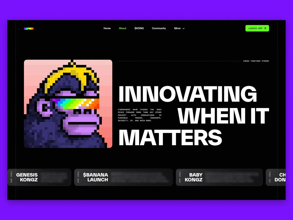 CyberKongzThe website and app design for CyberKongz, one of the original NFT projects, as it moved to a single token.